What Are Container Queries?
Container queries allow a component to respond to the size of its parent container — not the whole screen.
Instead of saying:
“If the screen is small…”
You say:
“If this container is small…”
Container queries allow a component to respond to the size of its parent container — not the whole screen.
Instead of saying:
“If the screen is small…”
You say:
“If this container is small…”
The modern websites are developed based on:
Even in plain HTML and CSS, we think in components now.
Container queries allow each component to:
This is a major change in thinking of responsive design.
The websites that are modern are not crafted as the big, fat page anymore, but rather made out of reusable elements such as cards, buttons, and navigation bars. Developers do not have to design everything in relation to the entire screen, and instead design small, independent units of UI, which can then be reused in various layouts. The technique is typical of design systems and structures such as React and Vue, but it can also be used in plain HTML and CSS. Container queries achieve this technique by enabling each element to react to the space that it is actually taking, and not the full screen size. This leads to more flexible, reusable, and less breakable components moving around, changing the responsive design approach to a component-based approach.
Let’s simplify the difference:
Media Query
Container Query
Think of it like this:
Media queries control the city.
Container queries control the house.
Media Query
@media (max-width: 768px) {
.card {
flex-direction: column;
}
}
Container Query
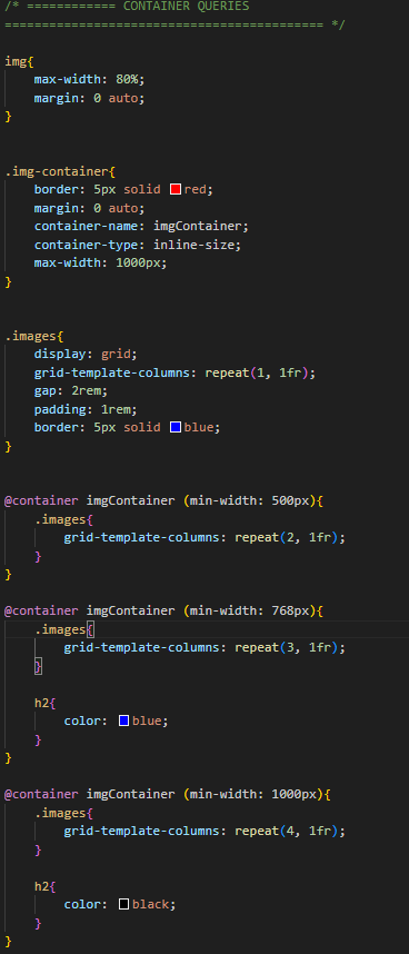
.card-container {
container-type: inline-size;
container-name: imgCard;
}
@container imgCard (max-width: 400px) {
.card {
flex-direction: column;
}
}
No
They work together.
We still need media queries for:
Container queries are for smaller, internal layout changes inside components. Modern responsive design uses both.
Yes
Container queries are supported in modern browsers including:
Humanized Text:
Container queries have become a reality in all the major modern browsers, such as Chrome, Edge, Safari, and Firefox. Such massive support ensures that developers are free to use them in practical applications without having to worry about compatibility problems with the majority of users. These browsers that support container queries are deemed safe to be used in production in the current web development environment since they handle virtually all web traffic today. In the case of older browsers, fallback strategies can still be used, whereas in the case of up-to-date environments, container queries are completely safe and can be utilized.
Web development is moving toward:
Container queries support this evolution perfectly.
They allow us to build components that are:
Instead of designing pages first, we now design components first.
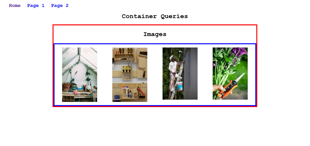
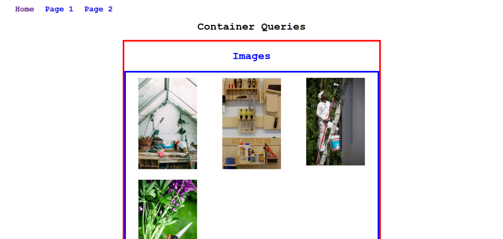
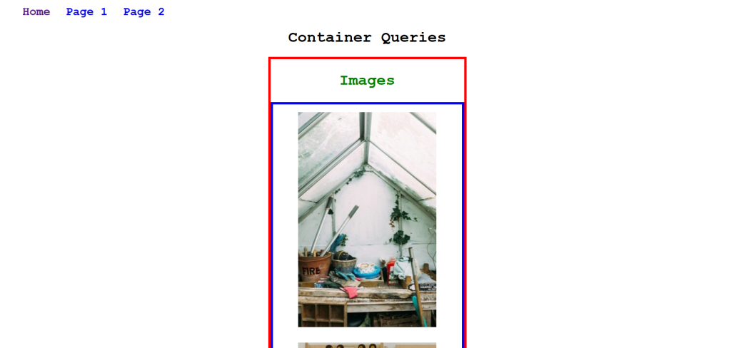
Here, the child element is reacting according to its parent element, not the viewport
The following question has always been in the focus of the theme of responsive design:
How does a website behave when the size of the screen is changed?
This is what they had been doing with media queries over the years.
In simple terms: