Compton’s Hardware Website Article
Small Business Website Design and Development: My Learning Process.
Project Introduction
In this project, I created and built a web site in a small local company, Compton Hardware Store. The primary goal was not to make a viable and attractive site, but also to learn more about the entire process of web design, including the initial planning and the end result. This experience has taught me that the process of design and development is no less significant than the final product. All these steps in the process were a way of influencing my choices and making me more capable of critically thinking of user requirements and design decisions.
Structuring and Planning
I took time to plan the structure and content of the site before I wrote the code. The step allowed me to learn about the significance of information hierarchy and clarity of navigation. I found the essential pages Home, Products, Services, and About and made sure they can be accessed with the help of a simple and easy to use navigation bar. This stage of planning demonstrated that a clear design can be much more helpful and understandable than any visual effects included in it. This is because by putting more attention on the content organization I was able to provide a more user-friendly experience.
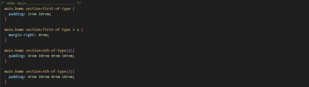
Technical Problems and Problem Solving
The production of layouts without the use of CSS classes to a significant degree was one of the key challenges that I encountered. This necessitated the use of selectors like: first-of-type and: last-of-type, which were at first restrictive. Nevertheless, this challenge was overcome and allowed me to get a better insight into the CSS structure, specificity, and logic selectors. I also found out that the minimum details of design, including the regular spacing of headings and paragraphs or using emojys in place of icons can greatly enhance the professionalism and believability of a web site.
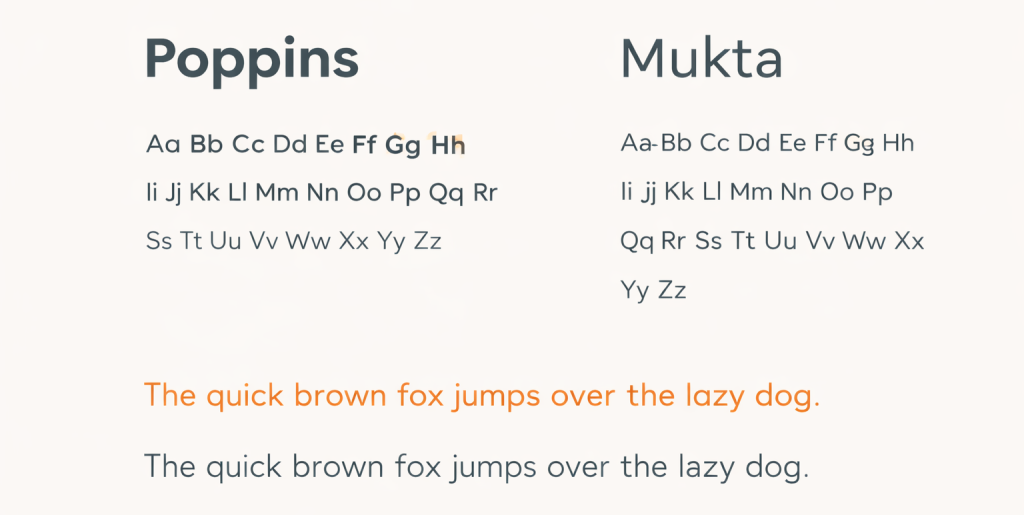
Typography
In the case of typography, I have used Poppins in the case of headings and Mukta in the case of paragraph and body text. The reason why I chose Poppins is that it is clean and geometric; therefore, it renders the site a look of a modern and sure thing; hence, it can be used in headings. Body text was done using Mukta because it has a high readability and it has an easier contrast with the headings particularly on small screens. The combination of two complementary fonts was also used to create an evident visual hierarchy and maintain the design as balanced and cohesive.
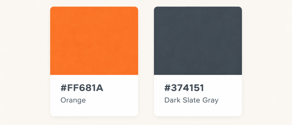
Colour scheme and Visual Resources
Relating to colour, I used a very simple and consistent palette, to strengthen the brand identity. I selected the main accent colour in form of #ff681a since it gives vibrancy and friendliness to the important items in the web page like buttons and call to actions. I selected the background colour of the footer to be in the form of number #374151 which was the background colour that would make the footer stand out of the main content but at the same time, the background remains in the same colour scheme as the rest of the site.
Visual Resources
On imagery, I have used the Unsplash site to source photographs, after which I chose high-quality and royalty-free pictures depicting tools, workshops, and small business settings. These images assisted in improving the site without distracting the contents.
Logo Colour Choice
I will be applying the colour or the logo with the help of #ff681a and #33ba66 to come up with a powerful and familiar brand name. The orange colour is associated with energy and approachability whereas the green one with trust and reliability. The combination of these colours that made the logo salient and, at the same time, professional and matching the general visual range of the site supported the idea of Compton Hardware Store.

Responsive Design and Development Process
The creation of the site in HTML and CSS paid attention to clean semantic writing of markup. I gained an understanding of how the proper application of elements like header, nav, main, section and footer, enhanced accessibility and readability. The other main learning outcome was to follow a mobile-first approach. Making a design on a smaller screen initially made me think about what content was important to include and made the design adapt to larger screens. This practice facilitated the overall responsive design process by making it more effective and efficient.